1 May 2010

World Mapper

I came across a selection of political maps through a BBC documentary that I feel are quite important. I know the sound of a documentary on maps and their origins seems very anorak and to most quite boring but i have to say Im really glad I took the time. One key point made was that a lot of the obscure warped maps we have of the globe through history are not solely because of mathematical error but was often the result of political views held by whoever made the map.

The first widely used maps were called the Mercator Projection (below) This put emphasis on developed countries,
one of the most obvious examples being Greenland shown as larger than Africa.


It was in 1973 that liberal German man Dr. Arno Peters decided to produce a global map based on his own measurements and calculations giving rise to the Peters Projection (below) This was a hard hitting piece of graphics that whipped up a storm and was paraded by liberals everywhere, but also shunned form not only a political stance but also because Peters calculations. With the information and technology we now have we can clearly see that even this view of the world is a warped version of the globe as we're given it today. Peters repeated and stood by his calculations but you can't help wonder how much of a miscalculation this may have been over his own political views.


The idea that no matter how neutral a map may appear it is always influenced and warped by the social and political views of its creator is where the inspiration of the "Worldmapper" project was derived. It is a collection of maps that visually show the proportions of over 700 different statistics in relation to the contents size (examples below)... I think this is quite simply genius! And an effective and assertive way of representing the statistics that are thrown at us everyday in a form that is clear to understand and helps you to gain some real perspective on global situations.
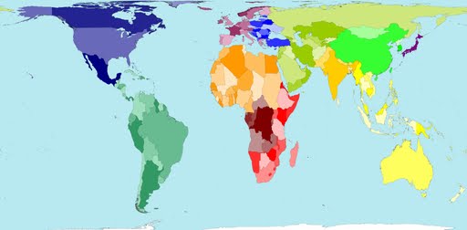
Territory equals it's land mass area.


Territory size shows the proportion of money spent on public health services.
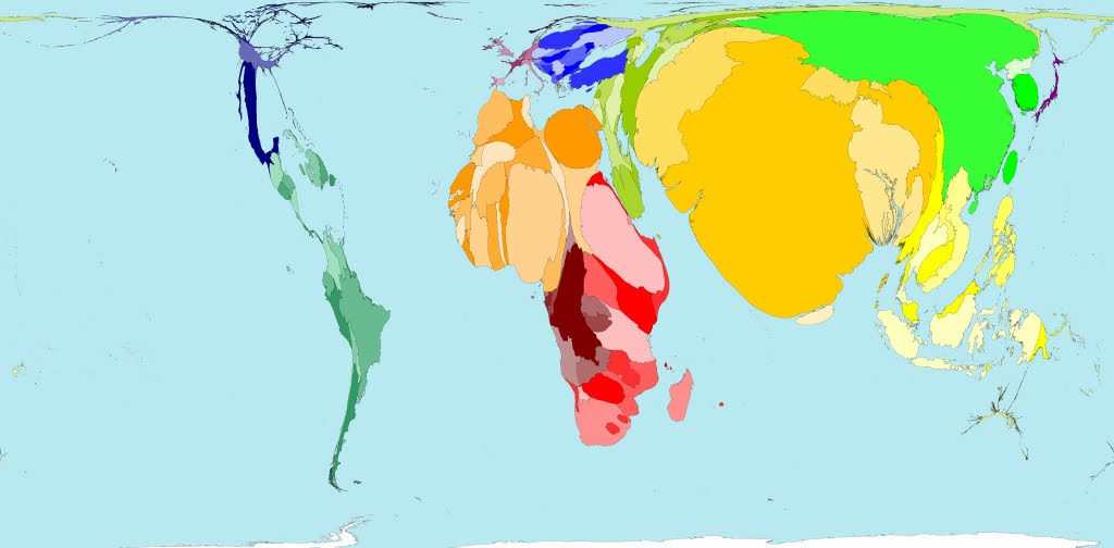

Territory size shows the proportion of people living in poverty.


Territory size shows the amount of greenhouse gases emitted.


Territory shows the proportions of Rain forest we lose...

compared the amount that is replaced.


For more statistical maps sift through http://www.worldmapper.org/index.html

30 April 2010

Photography Degree Show


These are the designs we put forward for the end of year photography degree show campaign exhibited at the cube.

28 April 2010

Einstein's Dreams


For my photographic narrative I had chapter 10 May 1905 of the book Einstein’s dreams. This chapter was touching and effectively conveyed feelings of loneliness and the idea of isolation. There is an extra element of sadness represented by this chapter in the idea of these sensitive people are so effected by an incident or point in their life that they effectively get lost or begin to build their own mental prisons. For my series of photographs I had originally wanted to set my photographs to show people building walls of sorts around them but this didn’t cover enough of the ideas within the chapter for me so instead I carried the chapter in my mind and kept a camera by my side in order to capture single and quite abstract representations of what the chapter meant meant to me.

I have converted all of the images to gray, this was because I find the chapter although starts off quite colourful when describing the town quickly unfolds into a bleak, sad and colourless environment, devoid of much hope. This idea as well as individual messages is what I have also tried to capture through my subject matter and looked at what an abstract situation or object might be able to represent within the idea of solitude and loneliness.


"empty shell"


"direction"


"lost time"


"soul"


"last egg"


"inner scream"


"time line/knot"


"compass"

Examples of photographers i found to hold some of the same ideas and set the same tones/emotions I wanted to convey.

26 April 2010

Aphex Twin - Nannou

Wow. This video as so aesthetically pleasing on so many levels. It is a magical and eerily beautiful piece directed by Laurent Briet for Aphex Twin’s single “Nannou”.


15 April 2010

Temporary Autonomous Art

Temporary Autonomous Art (TAA) exhibits work of all media and invites anyone of a creative nature to come down and join in or help out where ever they can. It's organised by an underground arts and culture based community who have organised events like these in a number of cities, involving live art, creative workshops, circus skills/poi workshops, relaxation/healing spaces, films, food and so much more. They help to transform unwanted and sometimes terminal buildings into open expressive creative socialising spaces, even if only for a few days. These images are just a fraction of the amount of pieces produced at the last TAA I attended.


13 April 2010

End sting

I was given the logo for the Museum of Modern Art (MoMA) and asked to create an end sting based on the styles and ideas behind MoMA and what they do. I produced a number of story boards for different aspects of art and design held by MoMA ranging from film and photography to typography and print but I unfortunately only had time enough to produce two of these as final storyboards and then animations.


This is an end sting for MoMA based on Andy Warhol's print work specifically but is representative of screen printing and art work in general.


This is an end sting for MoMA based on Constructivism and New Type. For both of my animations I have simplified the concept as much as posible. In doing so I feel that the New Type end sting is the strongest at represents with clarity the aspacts of design it is supposed to.

8 February 2010

Pigeons

For this project i was teamed with other second year students from a variety of pathways. Jay and I are from Graphic Design, James from Illustration and Liz from Moving image. Overall I think we worked well together and although presses for time to complete our original vision we were happy with the compromises we had to make. As the manager I enjoyed working with new people and being able to motivate and mediate amongst the group.

The idea behind our animation was the concept of looking at the door as the separate choices we make through life. Although we each chose a section of the animation we wanted to represent a personal element of the choices we have made, we could all relate as many people could to all of the situations. We worked well to tie these elements together under on theme and were happy with the outcome.

For my section i chose to represent the idea of taking drugs. This wasn't just to show the swirly psychedelic physical affects stereotypically associated with drugs, but also to represent how this changes your perception on the people and other choices around you.


Stop frame animation of the walls to my room.


Stop frame animation of the hans incorporated into my room.


Unfortunately I'm unable to upload the file of my room animations but for the full feature and behind the scenes info log on to http://pigeons-blog.blogspot.com/.