19 May 2010

Analysing text by Sylvia Harrris


Searching for a Black Aesthetic in American Graphic Design:

Sylvia Harris has drawn together evidence to add weight to her understanding of the impact of black culture behind the key figures and points of style in art and design. She is trying to focus young African or African American graphic designers to draw on their cultural influences rather than to emulate the established main stream aesthetic. She has highlighted quite poignantly the pitfalls for African cultural groups within the design industry. Her belief that by not embracing and intermingling the culture of African and African Americans within design we have lost a style aspects which would benefit the industry as a whole, and that African and African American have inadvertently done themselves a disservice as by adopting the main stream norm they feel under confident with what they have to offer.


She has also made it obvious that she believes it is because of the industry that culturally this group of new designers did not have any other option if the where to succeed in the profession. Her spirited words highlights that people from this culture are now starting to have more confidence and belief in their heritage is allowing them to showcase their culture in their work but this confidence is something which needs to spread through the African and American African design community before their input will be truly recognized and fully appreciated. She encourages the reader to investigate this further as she fully accepts her research is not complete.

Our profession has always been open to new ideas but these ideas mainly came from northern America or Europe, the major more successful designers came from these areas and like all people starting out we try to emulate those we admire so with no one using their heritage ("memory feeds projects, projects guide activity " – (Fabrizio M Rossi-Typographer) as a basis for their work the cycle becomes self perpetuating.

Fabrizio M Rossi


The article opens rhetorically to emphasize the point that awareness of African & African American graphic designers has gone largely unrecognized throughout history. The facts are produced so quickly it emphasises your own ignorance and draws you in to the subject; and offers us a possible alternative through the voice of our piers although in reality their influence is almost unacknowledged and forgotten.To enable us to relate more easily to the text she reflects on her situation as a consequence of history (both personal and global) and how this has caused true talent to be unrecognized, undiscovered or undeveloped ("communication in every which way is everything for the leader")– John Meada-Graphic Designer). Harris tries to help us understand the psychology behind how this has happened and how this has caused under developed talent. Which has left designers feeling like an outcast in the industry and has put inspirational young black designers at a disadvantage. This has lead to imitation & a lack of imagination and innovation by a groups of designers trapped within a demoralizing system.


John Meada

To emphasise the point Harris looks at the contradiction in leading designers work ethos that challenges the accepted boundaries against the disadvantage of having boundaries to which African and African American do not fully relate. It seems that she is stating the obvious once it has been pointed out to you. Every child rebels against it’s own upbringing at some point and at the end of this rebellious period they have developed into their own person. How can some one who has had to suppress their own heritage and feels they have to accept another rebel and develop into the designer they should, their rebellious period has been spent trying to absorb the more acceptable culture of the industry.

King Olivers 1920's

Harris talks of black music history as strongly inspirational for black creators to re-enforce this point and to show that it (inspirational black design) isn’t reflected through the design industry. Inspiration from style and from flair which are present not just subject matter but these attributes have more often than not been over looked by focusing on European influences. The text seems to show the hypocrisy in this focus as there is a hidden depth to our culture provided by African influences which have been buried in design and culture archives. Our culture and design history is full of utopian ideas, a design culture that nurtures and feeds budding designers but we appear to be trying to reach it without acknowledging what every one has to give to it.

To help remedy this chasm in design history Harris pieces together small elements of recorded African culture design history to try and show what the Black ethnic legacy within the industry has been and how much had gone unnoticed but as she explains the task is often difficult as work and disciplines are widely scattered across the genre, and often misrepresented by piers and records alike. We are only offered small glimpses through Harris’ piece to the genuine origin for African-American inspiration. Through it Harris takes us through the 20th Century with brief incidences and attitudes that give us an idea of the tone of the design world over these decades.


(examples of Picasso)

1920’s New Negro Movement; Harris writes about this era with vigor. She opens this section with the essential point of initial inspiration pointing out that early cubist artist, one being Picasso took a lot of inspiration from African art something that I have never looked for nor considered but an obvious point that which visually you could not dispute. To me the most obvious of these comes through the screaming colours as well as some of the abstract geometric almost symbol representation of people and places, and how these inspirations in turn came round full circle as 1920’s American Jazz culture saw a revival of cubist aesthetics through African art.


(examples of Harlem Art, 1920's)

Jazz over this decade had become the stylish word. It started as a style of music for African American people of the time. This style in one word I’d say “energy”, it was a fresh expressive style built on confidence that was both Black inspired and owned. This energy spread outwards across all communication media resulting in a buzz of new publications; these were often produced at Black owned and localized printing presses in order to produce a true reflection of African-American culture as the racist attitudes of society at that time greatly hindered. This freedom in self-expression resulted in a whole array of art, graphics, literature and music dedicated to the energy of African culture. Over this decade Harris depicts a scene of blurred professions and experimentation, and tells that from this came the magazine “Fire!!” designed to quench the thirst of the Anti-Victorianism at the time. Aaron Douglas Covered for this quarterly magazine and through it produced some of the most iconic graphics of the Jazz era.

Harris talks about the confidence and energy of Jazz and how the same ideals could be used to fuel the designers of today and also makes points on the importance of being able to link your inspiration to your heritage. I believe this to be a fundamental factor in realizing yourself as an individual just as much as understanding yourself as a designer. This is in part why I don’t agree with Harris talks of the art phenomenon “Cultural Hybridity” as being an element that would squash imaginations of African American designers. To me the ideas of “Cultural Hybridity” are those of collaboration for all ethnicities and an equal foot holding for all but this could only be truely achieved if we honor all creatives from any generation and ethnicity.


An interesting point of irony and some what shocking situation cited in Harris’ text comes from the statement that in the early 90’s Arthur Jaffa an established filmmaker, at the first ever Organisation of Black Designers (OBD) Conference named David Carson’s “Gun Ray” Magazine as offering the best example of “jazz aesthetics”. This seemed to be a clear example of how white designers and the industry have utilized African and African-American culture with certain design styles. Inspiration from black culture and the position of white designers such as Keith Haring along with white influences running the western design industry were able to successfully market and in some opinions exploit some key style features of black tradition.


(Examples of Keith Haring)

Harris concludes the piece on an aspiration note giving us examples of black designers still working solely for black audiences and incorporating African style and expression, and that in doing so are keeping a long line of design tradition most of which if not realized by now is yet to be discovered. This is where we are left with the reminder that every morsel of information we’ve been given is exactly that. The whole piece down to the last paragraph is designed to ignite curiosity mainly amongst African American’s and any budding black designer but also to anyone who would seek the truth of the history behind their vocation, and offers the starting points for us to initiate our own fact finding missions in the hope that one day true recognition will be made to the black design society for their contribution to the arts and media since the beginning of the 20th century.


Bibliography

Websites:

www.artcyclopedia.com/artist/douglas.aaron

www.answers.com/topic/claude-steele

www.pbs.org/wgth/pages/frontline/shows/sats/interviews/steele.html

www.davidcarsondesign.com

www.graphic-design.com/creative-net/black_history.html

www.mitpressjournals.org/dvi/pdf/10.1162/desi.200925.3.3

Books:

African American Modernist/

Aaron Douglas, 2007/ Museum of Art, The University of Kansas, Laurence.

The Art of History: African American Women Artist Engage the Past/

Lisa Collins, 2002/ Rutgers University Press, New Jersey.

Walls of Heritage: Walls of Pride African American Murals/

James Pridoff, Robin J Dunitz, 1997 / Pomergranate Communications Inc. Europe Ltd

Rediscovering the Harlem Renaissance, the politics of exclusion/

Eloise E Johnson, 1997/ Garland publishing inc. New York & London.


A History of Graphic Design/

Phillip B Meggs 1998, John Wiley & Sons, Inc.

10 May 2010

Just nice

I went to donate to my poor friend running the 10k in Manchester this month. Once I had, at the end of my digital receipt there was a statement to replace the would be "recycled paper" line that angelically pushes their global awareness ethics and I thought was a nice touch.


.

9 May 2010

Don Hertzfeldt

I think Don Hertzfeldt is quite possibly my favorite short film animator, he's an American animator who's been producing for fifteen years with many awards under his belt. I've recently come across recent releases of his on YouTube so felt the need to share.
His back to basics minimalist illustration style is reminiscent to anyone who has sat a doodled their own flick book animations (a perfect pass time for French lessons) and because of this has many endearing qualities which he uses to communicate liberal messages of his own opinions and societies values, but also to be as creative and expressive as his humorously dark and delightfully cynical imagination will let him.

This first animation "Rejected Cartoons (2000)" was born from his anti-consumerism values and his temptation to produce some of the worst cartoons he could think of for corporate companies in somewhat feigned hope that one might make it to air. The animation takes us through a series of rejected commissions through which the animator eventually breaks down consequently taking the world and characters he's created with him.


"The Animation Show (2003)" holds one of the messages I think speaks to a lot of adult content animators out there that have had to defend their medium of art to the unimaginative conventional minded folk that view it as juvenile. It sarcastically pushes the juvenile element of adult animation hard but if you can listen past all the flashing lights and special effects you will hear a poignant line or two on the expression of art through the animation medium.


Ever wondered why some kids are scared of balloons?...


I'd love to tell you where to go to checkout Don's collection but unfortunately they are hard to come by in the UK without paying a penny or two for them so here are a couple of other Hertzfedlt treats to be found on YouTube: Lily&Jim Pt 1/Pt 2 and Ah L'Amour.

4 May 2010

Design Ind

For this assignment I was asked to look into the design industry in the UK to discover what was going on out there and what aspects of that i was interested in to then hopefully gain portfolio visits as well as contacts by opening up a dialogue. Over the weeks this assignment ran we also had the opportunity to listen to some guest speakers currently working within the design industry.
One of these design agencies were "Thoughtful". They are an ideas design company. This really is made clear through Thoughtful' blog and all the nice concepts both little and large they produce just for fun and to use their imagination. Despite the company being fairly young the three that make up Thoughtful have over 25 years experience between them working for some of the best advertising agencies in the country and can boast their skills with collections of creative awards.
This aside the aspects I really liked about Thoughtful were work ethic and and openness to draw inspiration from some of the most random objects/situations we can find. One concept produced by Thoughtful that I really loved was an idea on low impact advertising aimed for"howies" an ethical extreme sports clothing line. The idea behind this piece is that it would be clearly visible to anyone walking on the beach, and relevant to most that would cross its path. But it is only temporary and as the tide comes in the message wipes out ready for tomorrows fresh piece of news.
I found an example of how this idea was being applied within the city center as power hose stencils are used to create "think safe drink safe" messages onto the dirty path stones at bus stops and student areas of Manchester.


Another guest speak we had come to visit is is Alun Cox from the design agency "dust". They are a multimedia design agency established since 2000 and based in Sheffield, UK. Their work spans out covering everything from publishing and exhibitions to typography and photography. Despite having fingers in so many types of pies dust are far from what you would call a jack of all trades; they are examples of colaborators pulling together many different mind stes and skills to produce some of the best work in the field.


One product that stood as an example of commitment and to me as a forgotten level of care and attention to ones work was the photgraphic book produced with photographer Clive Egginton. These professionaly styled books were silk screen printed and hand stitched individualy! It is a monument to old school professional techiques and attention to ones work
Another book Alun talked about producing was "The Water Gareden City" this was one of those epic stories of intense design and production that in this instance seemed plucked out of a fairy tale. It was a one edition produced for the King of Bahrain: graphically illustrated the book held information on certain local developments.

A branding example i really like of dust's is the DS:93 identity, purely for it's easthetics if i'm honest. DS:93 sell high quality top end records, boasting that they don't touch repressed records, cd's or downloads.
dust are also pioneers amungst illustrtors world wide. Besides skillfuly producing their own illustrtions form their own designers they also along with Mike Marston bring together some of the best minds in the illustration feild under "Fine and Dandy" and represented by the"Central Iluustration Agency"


Over the pst few weeks i've contacted many design agencies only to be met by many brick walls unfortunately. Some conversations have been positive so I'm optimistic about future visits but will keep in contact over summer at least.


One of the he first agencies i contacted were "Drum Beat". They are a Manchester design agency working in print, campaigning and branding. Looking at their approach to work it sounds like they understand the importance of a professional but relaxed working environment and that they are decent collaborators preferring to work together in a studio over solitude at home. As many design agencies have now days they also have their own "Recycle, Reuse and Renew" ethos which i appreciate.

I think one of the aspects of "Drum Beat" that drew me to them the most was their work with "Re:act" magazine and "Re:action" newsletter. This is social and political biannual publication designed to provoke debate about ethical, environmental and other global issues. I would love for the opportunity to work on this magazine and with some of the people that have the information to produce it. Drum Beat are defiantly a pestering point of the summer.


Another of the first agencies I contacted were "Glorious" also based in Manchester. They are a professional company with many awards and achievements under their belts from D&DA, Design Week, through New York Festivals and National Graphics to Euorpean Advertising and Design. They are very successful and fully dedicated studio of designers that take their work seriously, to quote "graphics are the reason we get up in the morning", which is exactly what you would want and expect from any professional agency.


Rummaging through their digital archives I came across work produced for many institutions that i've either visited or been involved with some way. Living and studying in Manchester for so long ad the familiarity of some of these designs and clients such as the Contact TheatreandCornerhouse makes me feel comfortable with the section of the industry i could be involved with. Alas this will be on return of contact but still a definite pestering point of the summer!


Thoughtful are another design agency that I'm in contact with at the moment. Their work ethos and approach to all of it is what impresses me the most i think, bleeding out to be reflected in a lot of the pieces they produce. Some of my favorite of these are the aforementioned low impact howies advertising,
and also the sarcastic typography piece (which if you read the inspiration is an aspect of communication we can all relate to but as a dyslexic i found it particularly amusing and an issue i deal with on a day to day basis)

Another pice i really like is the "Pantone Chips" concept. Although there is no explanation to it's origin i find it interesting to realise that you really don't need text on a bag of "crisps" to know what it is and was reminded of the initial flavor confusion when Walkers swapped their salt&vinegar and cheese&onion packet colours. :]
I went to visit the Thoughtful studio and met with Stuart and James to show them my portfolio. They liked the presentation of my work and were especially impressed with the animation end stings I produced for MoMA's logo. I think the flicker books really help to bring alive the concept much more than just being able to view a story board. The only tips they had in regards to my portfolio was to keep on adding to it and to build on my body of work away from my degree as much as possible.
Stuart and James were really welcoming and down to earth. While reviewing some of my work we also chatted about general studio practice and more to the point attitudes. Thoughtful are an award winning conscientious design agency inspirational to young designers and to any budding entrepreneurs wishing to set up business for themselves. They, as a self established agency set out to give students within in design pathways opportunities and experiences that many past students including themselves wish they'd had. They're situated conveniently above Stockport College enabling first hand contact with not only industry experience for students but also a first glimpse for Thoughtful at what up and coming talent and trends might be. The studio also holds an open door policy, anyone willing to help is welcome. So I look forward to seeing what Thoughtful are up to over the summer.


Along my search for portfolio visits i have come across a few smaller but interesting design companies. The first being a design agency called "Lake". They are based in Hale and besides branding and identity for conventional day to day businesses they also have some "hidden depth" (section on Lake's homepage) to their portfolio including publications and advertising for adult themed projects.
I like their professional approach to certain subject matters adding real elements of fun and something a little different; Their comment on approach to design work stood out as an element of any graphic designers manifesto.
I've been in contact with Kerrie from Lake. I understand i will probably have to drop w few reminders but she has said as soon as they have the time they will contact me to bring my portfolio to the studio.


Another agency i've come across is "Jammy", They're a Sheffield based design agency working in publications, promotions and package design. They appealed to me with their simple but quirky website that reminded me of elements of my own blog although just based around jam. One favorite aspsect of their design i lake is the graphical illustrations and layouts to the Arts/Theatre publications they've produced.
Unfortunately Jammy are in the process of relocating and have asked if i could contact them in a couple of months.

"Monkey Feet Design" are an agency based in Cheadle Hulm, Manchester. They work across many fields and i really like the campaign they worked on promoting information of BT and how much they were scamming their customers, this was in the form of a direct mailing piece. Monkey Feet also have a specialised section in illustration. This is a collection of professional and established illustrators working for/with Monkey Feet Design. I'm yet to hear back from this studio.


One of the agencies i've discovered in "Val ltd" They are a professional printing company wo do have their own in house designers for elements of their productions but most of all hold many high end clients as posted on their site.

I went to visit Val and met with the owner Vernon Bradshawe, a friendly welcoming business man in the industry for over fifty years. The building itself was tucked away in the back roads of stockport making it a bit of an adventure to find. When i arrived i was ushered through some of the studio and production spaces immediately helping me feel at home with familiar smells of workshop equipment and activities. I also discovered that Val had actually been producing and even designing a couple of the T-shirts for a Manchester alternative cloths shop I had been buying from for over ten years. It was nice to be able to put a face to the product.

Looking through my portfolio Vernon was impressed and thought it held a good use of space and after an hour long discussion offered me the opportunity to test prink any designs i'd like to apply to T-shirts in the future.

The advise Vernon offered me is poignant to any budding designer I should think, that was to keep on top of the latest software and anything that is designed to make our jobs/life easier. And the other was to start gaining an idea of the cost of production and the products them selves, with trends these elements are always changing.
With an outside project I have been working on the opportunity to test some of my prints is fantastic and something i'll be utilising over the summer.


Overall although i have found this assignment difficult at times in respect to contacting and hearing back form agencies and feel as though it has really been good experience in the form of a wake up call. Networking and building on my portfolio can be very time consuming and are defiantly focal points for myself. I think i'll be promoting myself as a "professional brew producer" to any agency that will take me over summer.

3 May 2010

Analysing work

I was given a list of songs from a variety of bands held on the “Rough Trade” label over a number of decades. We were asked to provide a poster campaign. Packaging for three record compellation album being released by “Rough Trade”.

Going through the list provided I couldn’t help noticing all the colour names either of the bands or their songs; Even just reading the words sparked up any different connotations and certain feelings which were in the most clearly connected to the style of song or even the band itself i.e. “Red Crayola” –“Blue Orchids”

It was a natural progression when focused on colour and emotion that I felt drawn artistically to the idea of abstract expressionism. One artist from this region that I appreciate is Mark Rothko. I think his work is not only aesthetically pleasing but really has the ability to draw you into the space he creates not unlike the ability of a good song. Because of style and genres of the listed bands I felt Rothko’s work displayed more tranquil aesthetic that the one I was looking for and I didn’t feel that this style would represent “Rough Trade” itself.


This is where I turned to the other spectrum of abstract expressionism looking at more familiar work of Jackson Pollock. I found that his work had a lot of the energy I was looking for and wanted but focusing more on the idea of emotion as single colour to represent this. I also came across a quote of his that confirmed to me Pollock was working along some of the ideals Rough Trade were about but within his own field of expertise: “Abstract painting is abstract. It confronts you. There was a reviewer a while back who wrote that my pictures didn't have any beginning or any end. He didn't mean it as a compliment, but it was.”-(Jackson Pollock)

(Jackson Pollock - Full Fathom Five - 1947)


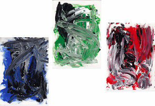
From here I went on to create my own experiments of expressionism painting, separating my emotions into Bleu, Green and Red. I selected a few songs from each album, I listened them to try and influence the final outcome giving each album it's own individual input. After producing a few pieces of expressionism for each colour I chose the versions that held the most texture because they held the most interesting areas to work with.


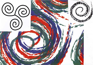
Again still carrying these ideas of colours and emotions, and that these are a form of emotional release that almost anyone can relate to sent my direction towards the ideas of this release being primal fundamental one of humankind. So I started to back track and came across a couple of symbols that really stood out to me. The first is of a simple spiral. It’s the oldest symbol known to man: not only representative of life and energy radiating but they also stood out to me conveniently enough as a record in itself.
There was another symbol that grabbed my attention, this being of three spirals linked together.This symbol although copied over generations as a Christian symbol of the holy trinity and other religious groups for its visual connotations, is essentially a prehistoric symbol thought to have represented the three stages of human life and growth within these, also the waxing and waning of the moon. And again well it also conveniently resembled what could be the three record joined as one. It was also a nice example of pulling together my three albums as one entity and representing different phases and stages of people and their emotions.


Pulling these concepts together I decided to use the triple spiral as the logo for that particular record release. I created a vector version of the symbol and applied different brush strokes until I found one with a texture I liked. I then copied and converted this into the three colours I had chosen.

To produce the sleeve covers I applied cropped and altered versions of my abstract paintings. Inspired by human emotion and the colours themselves I named each album accordingly as the blue “Deep”, the green as “Centred” and the red a “Passion”. Although a little pretentious sounding I thought they summed up what I was trying to convey and also ran nicely as a sentence as opposed to individual titles. I also decided to place a version of the logo over the record sleeves. I though that it would give a continuity to have the albums connected together as one when of the cover also discretely representing the differences in people coming from and back (and their emotions) to the same point visually tying the ideas together.


Using the record covers as the basis of design I created a cover for the compilation. I left the outer face white and applied the colour version of my logo that I think would have been effective in standing out from other surrounding designs. The inside I decide to reflect visually the piecing together of all three albums but if nothing else would still be aesthetically pleasing.

Lastly I tackled the posters. These were simple transitions as I used the design and typography as the basis and really felt the need to change the colour for each version. This was through the image and text but also by bringing the relevant colour within the logo forward making that tone more dominant.

I was quite happy with the outcome in the most part but one area I would definitely go back to focus on would be some of the fonts used. I think the overall design but mostly the record sleeves could have beneficial from further development possibly turning the font pt down and using clear serif font that would have given them much more professional appearance

Bibliography -

Books –

Jackson Pollock: Energy made visible, B. H. Friedman, Aug 1995.

Mark Rothko, Majorie B. Cohn, Feb 2001, Hatje Cantz Publishers.

Websites –

www.theartcyclopedia.com/artist/rothko_mark.html

www.jacksonpollock.com

www.whatsyoursign.com/celtic-symbol-meaning.html

www.whatsyoursign.co,/spiral-meaning.html

www.roughtraderecords.com/history

www.thinkexist.com