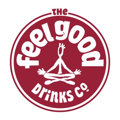
This is the logo for ‘the feelgood drinks co. They’re an organic drinks company and boast about their ingredients’ having no added sugar and being one of your five a day. Below is a breakdown of the different elements that make up this logo and their connotations.
Colour - In this example the signifier is the colour green, but is always an organic colour/shade across their product line. This isn’t only a direct connection to the flavour of the drink but also acts as the signified with its connotations of being fresh and organic. Another signifier that reinforces that idea/or ‘sign’ of the product being organic is the grainy texture you can see within the colour.
Shape - Now here the overall shape being the signifier I can see how it splits into two clear ideas to be signified. The first being that of a slice of fruit the outer ring acting as the skin, although not all fruit used would be this shape it is still an obvious connection. The connotations that come through are that of our own planet. This brings the sign of being organic like the other signs so far but also on some level of ethical conscience you would expect the company to hold.
Text - The first impressions of this soft and organic typeface stets a relaxed tone. Here if you look at the way the font is placed around the logo, this seems to possibly signify a sunrise, and this along with one of the most obvious signifier of the small touch in the ‘g’ give signs of well being and wholesomeness. I think the lettering at the top of the logo is a nice extra touch as well as it sits on the top as though on top of the world just adding to that feel good factor and sense of well-being.
Image - The image in the centre holds the most obvious connotations of wellbeing as we immediately associate this position with meditation and self-awareness. The added little signifiers of jazz hands over the figures knees ads a fun element to an otherwise serious or self important exercise, this would signify the company taking a more joyful and light hearted approach to the ideas of well-being.
Overall “the feelgood co” have pulled many different element together to fill your conscious as well as subconscious with a number of light hearted and organic connotations. These work together to form a visually busy but very effective sign as their logo.

No comments:
Post a Comment