
I was given a list of songs from a variety of bands held on the “Rough Trade” label over a number of decades. We were asked to provide a poster campaign. Packaging for three record compellation album being released by “Rough Trade”.
Going through the list provided I couldn’t help noticing all the colour names either of the bands or their songs; Even just reading the words sparked up any different connotations and certain feelings which were in the most clearly connected to the style of song or even the band itself i.e. “Red Crayola” –“Blue Orchids”

It was a natural progression when focused on colour and emotion that I felt drawn artistically to the idea of abstract expressionism. One artist from this region that I appreciate is Mark Rothko. I think his work is not only aesthetically pleasing but really has the ability to draw you into the space he creates not unlike the ability of a good song. Because of style and genres of the listed bands I felt Rothko’s work displayed more tranquil aesthetic that the one I was looking for and I didn’t feel that this style would represent “Rough Trade” itself.

This is where I turned to the other spectrum of abstract expressionism looking at more familiar work of Jackson Pollock. I found that his work had a lot of the energy I was looking for and wanted but focusing more on the idea of emotion as single colour to represent this. I also came across a quote of his that confirmed to me Pollock was working along some of the ideals Rough Trade were about but within his own field of expertise: “Abstract painting is abstract. It confronts you. There was a reviewer a while back who wrote that my pictures didn't have any beginning or any end. He didn't mean it as a compliment, but it was.”-(Jackson Pollock)

(Jackson Pollock - Full Fathom Five - 1947)
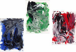
From here I went on to create my own experiments of expressionism painting, separating my emotions into Bleu, Green and Red. I selected a few songs from each album, I listened them to try and influence the final outcome giving each album it's own individual input. After producing a few pieces of expressionism for each colour I chose the versions that held the most texture because they held the most interesting areas to work with.
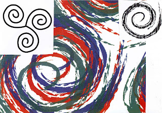
Again still carrying these ideas of colours and emotions, and that these are a form of emotional release that almost anyone can relate to sent my direction towards the ideas of this release being primal fundamental one of humankind. So I started to back track and came across a couple of symbols that really stood out to me. The first is of a simple spiral. It’s the oldest symbol known to man: not only representative of life and energy radiating but they also stood out to me conveniently enough as a record in itself.

There was another symbol that grabbed my attention, this being of three spirals linked together.This symbol although copied over generations as a Christian symbol of the holy trinity and other religious groups for its visual connotations, is essentially a prehistoric symbol thought to have represented the three stages of human life and growth within these, also the waxing and waning of the moon. And again well it also conveniently resembled what could be the three record joined as one. It was also a nice example of pulling together my three albums as one entity and representing different phases and stages of people and their emotions.

Pulling these concepts together I decided to use the triple spiral as the logo for that particular record release. I created a vector version of the symbol and applied different brush strokes until I found one with a texture I liked. I then copied and converted this into the three colours I had chosen.
To produce the sleeve covers I applied cropped and altered versions of my abstract paintings. Inspired by human emotion and the colours themselves I named each album accordingly as the blue “Deep”, the green as “Centred” and the red a “Passion”. Although a little pretentious sounding I thought they summed up what I was trying to convey and also ran nicely as a sentence as opposed to individual titles. I also decided to place a version of the logo over the record sleeves. I though that it would give a continuity to have the albums connected together as one when of the cover also discretely representing the differences in people coming from and back (and their emotions) to the same point visually tying the ideas together.


Using the record covers as the basis of design I created a cover for the compilation. I left the outer face white and applied the colour version of my logo that I think would have been effective in standing out from other surrounding designs. The inside I decide to reflect visually the piecing together of all three albums but if nothing else would still be aesthetically pleasing.

Lastly I tackled the posters. These were simple transitions as I used the design and typography as the basis and really felt the need to change the colour for each version. This was through the image and text but also by bringing the relevant colour within the logo forward making that tone more dominant.

I was quite happy with the outcome in the most part but one area I would definitely go back to focus on would be some of the fonts used. I think the overall design but mostly the record sleeves could have beneficial from further development possibly turning the font pt down and using clear serif font that would have given them much more professional appearance

Bibliography -
Books –
Jackson Pollock: Energy made visible, B. H. Friedman, Aug 1995.
Mark Rothko, Majorie B. Cohn, Feb 2001, Hatje Cantz Publishers.
Websites –
www.theartcyclopedia.com/artist/rothko_mark.html
www.jacksonpollock.com
www.whatsyoursign.com/celtic-symbol-meaning.html
www.whatsyoursign.co,/spiral-meaning.html
www.roughtraderecords.com/history
www.thinkexist.com


No comments:
Post a Comment