I came across a selection of political maps through a BBC documentary that I feel are quite important. I know the sound of a documentary on maps and their origins seems very anorak and to most quite boring but i have to say Im really glad I took the time. One key point made was that a lot of the obscure warped maps we have of the globe through history are not solely because of mathematical error but was often the result of political views held by whoever made the map.
The first widely used maps were called the Mercator Projection (below) This put emphasis on developed countries,
one of the most obvious examples being Greenland shown as larger than Africa.

It was in 1973 that liberal German man Dr. Arno Peters decided to produce a global map based on his own measurements and calculations giving rise to the Peters Projection (below) This was a hard hitting piece of graphics that whipped up a storm and was paraded by liberals everywhere, but also shunned form not only a political stance but also because Peters calculations. With the information and technology we now have we can clearly see that even this view of the world is a warped version of the globe as we're given it today. Peters repeated and stood by his calculations but you can't help wonder how much of a miscalculation this may have been over his own political views.

The idea that no matter how neutral a map may appear it is always influenced and warped by the social and political views of its creator is where the inspiration of the "Worldmapper" project was derived. It is a collection of maps that visually show the proportions of over 700 different statistics in relation to the contents size (examples below)... I think this is quite simply genius! And an effective and assertive way of representing the statistics that are thrown at us everyday in a form that is clear to understand and helps you to gain some real perspective on global situations.
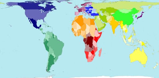
Territory equals it's land mass area.

Territory size shows the proportion of money spent on public health services.
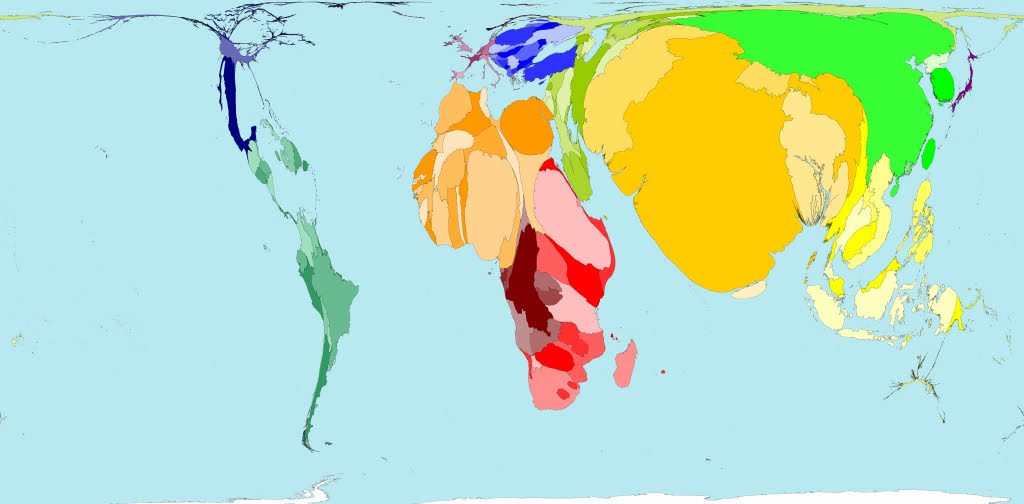
Territory size shows the proportion of people living in poverty.

Territory size shows the amount of greenhouse gases emitted.

Territory shows the proportions of Rain forest we lose...

compared the amount that is replaced.
For more statistical maps sift through http://www.worldmapper.org/index.html

No comments:
Post a Comment